
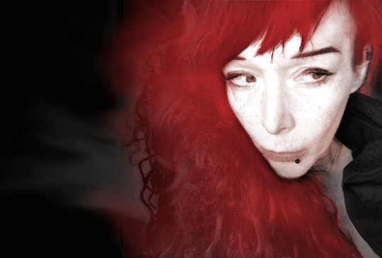
Cue crazy aliens, Nazis and zeppelins!: An interview with artist Sarah Anne Langton
The
brainchild behind the gorgeous cover to Lavie Tidhar’s acclaimed
novel CENTRAL STATION, Sarah Anne Langton has worked as an
Illustrator for EA Games, Hodder & Stoughton, Forbidden Planet,
The Cartoon Network, Sony, Apple, Marvel Comics, Apex Publications,
Angry Robot, Jurassic London, Fox Spirit, NewCon Press, Hachette,
“The Fizzy Pop Vampire” series, and a wide variety of music
events. She created the Hodderscape dodo publisher logo and serves
as a judge for the Kitschies Inky Tentacle for best cover art. When
not bound to her computer, Sarah daylights as Web Mistress for the
worlds largest sci-fi and fantasy website.
Tachyon’s
resident social media maven and sometimes editor Rick Klaw sat down
with the extraordinary Sarah to discuss working with Lavie Tidhar,
the
creative process, comics,
and
British Pop Art.
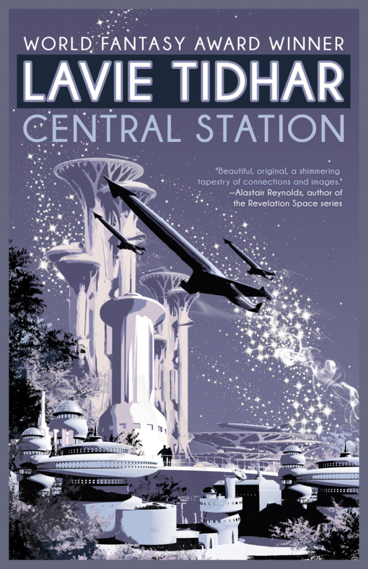
The cover for
CENTRAL STATION is one of many projects you’ve done with Lavie
Tidhar. How’d you first get involved with his work?
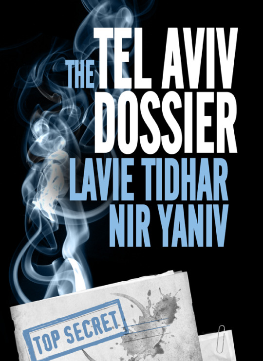
It was some terrible
accident *lol* No, we both worked with Jurassic London publisher
Jared Shurin. Lavie had seen my illustrations and wanted a cover
redesign for THE TEL AVIV DOSSIER. An email popped up up asking
“would I be interested.” I already knew his work and thought
“Hey, this is going to be interesting.” At least, I’m not going
to be designing anything dull! Cue crazy aliens, Nazis and zeppelins!
Sign me up!
You’re creations
seem to perfectly mimic Tidhar’s eclectic, manic nature. How much do
you confer with him? How do you work together?
Oh, constant,
constant emailing. As a starting point Lavie mails out some kinda
loose brief and a selection of images, to give me a feel for the type
of design he’s after. Then I’lll potter off and get a little
imagery down visually, so we have something to work with. Lavie’ll
mail over a section of the book I’m illustrating, googled images,
old posters – all sorts of stuff to give me some context to the
design that’s under way. There’s always a lot of ping, ping, ping
exchange of ideas and alterations to the original illustration until
we have some artwork that we’re both happy with. Quiet often then
“first pass” design looks absolutely nothing like the finished
artwork! THE CENTRAL STATION roughs are unrecognisable from the
finished book cover but, I think, we both always want the most
stunning finished imagery possible… so keep making changes until
I’ve ‘got it’ rather than ever leave anything at the “okay”
stage.We both have very
similar tastes in visual imagery so it all becomes more of an organic
process with the content, to try and capture Lavie’s ideas on
paper, as opposed to any discussion about fonts or colour selections.
And if it something looks a bit rubbish we both aren’t afraid to
say so…. which I’m sure helps!
You’ve got a
comic book short story written by Lavie coming out soon, Was that you
first foray into graphic storytelling? Did you approach the work
differently?
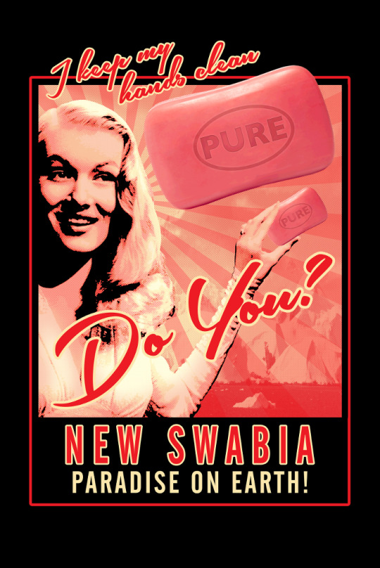
Yes, this a my comic
book first. I actually work in the comics industry but I hadn’t
ever illustrated any graphic work before. Weirdly. Designing New
Swabia made me really appreciate how many hours go into any comic
book – a whole bunch! Drawing a series of illustrations that work
sequentially and the telling of a narrative through both words and
pictures brings up a lot of purely practical illustration issues –
from making sure your zeppelin design remains consistent to making
sure speech bubbles can be read instinctively, in the correct order.
We approach the design process in a very similar way to, say, a
poster or a book jacket. You can probably tell as the end result
doesn’t look very much like ‘standard’ comic book fare but I
prefer to be involved in something a little more experimental and
‘left of field’. Very kindly the whole story was written bearing
in mind that I was going to be on illustration, so the imagery is
tweaked to suit my graphic style rather than using any more
traditional techniques.
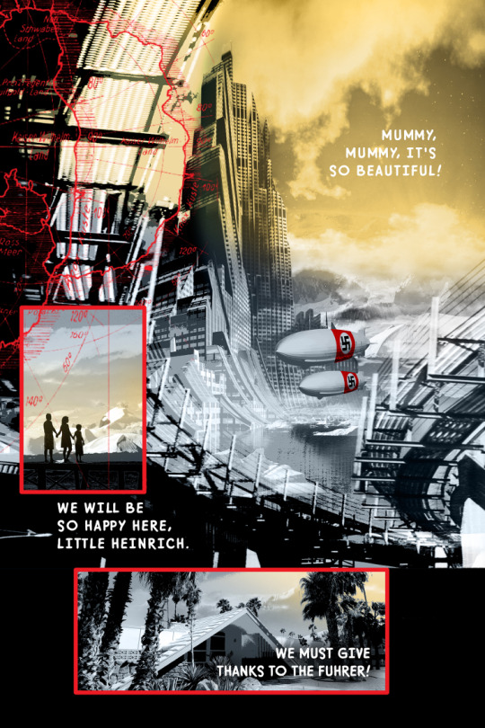
We have another
comic book tale on-the-go involving me drawing a lot of arctic
wilderness and alien lurking horror. Well, this is Lavie, what do you
expect? But that’ll be a while in the making even though Mr Tidhar
will not stop having amazing ideas 🙂
Many of your
striking images are reminiscent of the advertising/proganda posters
of mid-20th century. What attracts you to this style? What artists
influenced your works?
I love the clean
graphic simplicity of retro poster design and 1950’s advertising.
The simplicity of line, shape and colour always makes me want to
emulate that type of illustration and give it a contemporary twist.
The flat, block colours and minimal nature of the design work I feel
alway gives it such visual impact – always very striking – something
which is never a bad idea if you’re designing a book cover! I used
to do a lot silk screen printing so I love breaking down photographic
imagery into single, stunning shapes. The contrast of the four colour
screen prints used with mid-20th century advertising and propaganda
are so powerful and bold it’s something I try to mimic. Basically I
take the technical process of how, say, an art deco poster would have
been produced then replicate it virtually with photoshop. There’s
something is visually very compelling about this style printed
imagery, the balance of space and form is always so pleasing.
I particularly like
the work of Eduardo Paolozzi, one of the early British Pop Art guys.
His artwork mixes pop culture references and technological imagery,
man-machine stuff – I love the décollage mix! Warhol, Jamie Reed’s
punk masterpieces and the Russian Constructivist movement are a
favourite – super-clean, simple typography, something I always,
well, try to do. And the work of artist Bill Sienkiewicz – as
somebody who totally ignored how traditional comic book illustration
“should” look and brought in a healthy dose of fine art. Ignoring
how something is traditionally “supposed” to look is always a
plan. I’m basically a pop culture junkie – and probably shouldn’t
ever have been given access to the Internet – so I love anything
from 1950’s advertising to pulp to comics.
What is your work
process?
The design process
for everything is usually something like… google images, tea,
google images, tea… flap about for several hours, then make tea.
Eventually I’ll find the killer image to actually use for the
project but I do quite a lot of pottering about the internets for
inspiration. I hoard a huge amounts of photographic reference work
but will sometimes spend a day just trying to find exactly the right
photographic image I want to use. And only then start making the
“screen print” process to create a design from it. Virtually all
of my work is entirely digital, regardless of the medium, I design
straight into photoshop. Very easy to just keep fiddling about with
composition until it looks “right.” My main problem is people
writing interesting books, hence fascinating imagery, so I then get
distracted reading about Antarctic ice flows online or something. I
work full time, in addition to the illustration, so a lot of the
“process” is me just trying to keep myself awake at two in the
morning and draw!
What’s coming up
for you?
I think this new
comic book/graphic novel with Lavie is going to keep me occupied for
a fare while. I may never get to leave a Mac every again! I also have
some illustration work about evil nuns coming out for Jurassic London
and at the moment am designing branding and content for a new Steam
game. Conspiracy and dubious governmental goings on. Pretty exciting
as it’s a new medium for me to work in. And I always live in hope of
some more Central Station appearing! That’s all keeping me pretty
busy, which is probably a good thing… idle hands an’ all that 🙂
See more of Sarah’s amazing work at http://www.secretarcticbase.com/
For more info about CENTRAL STATION, visit the Tachyon page.
Cover by Sarah Anne Langton